


 One thing that my media product uses is a masthead. Like on all magazines mastheads are a key part of the front cover. It is also the most important thing to make eye-catching and memorable. When people are flicking through the shelves looking at magazines, if the masthead doesn't appeal to the target audience the magazine wont do well. The name of the magazine has to appeal to the target market otherwise it wont sell. The title of the magazine also has to be linked or to sound like your genre. For instance the name "smash hits" is a chart music magazine. This is a good title as it links into the genre of chart music.
 Like on any product you buy there comes a bar code. On my magazine there is a bar code. All magazines have bar codes no matter where and what colour. They are usually a rectangle or square shape, and come in black and white. Bar codes are important for when the product goes into sale as its used to sell the product, without it nobody would be able to buy magazines or anything for that matter, therefore they are very important. As well as the bar code a price is also included on the magazine in some shape and form. It's usually next to the bar code, but it can be situated anywhere on the magazine. The price is also important for sale, as without it people wouldn't know the price of the product, and it may be off putting to the costumer if there is no price as they will not know the cost and may have a shock when paying for it.
 Any additional information on the front of magazines are usually called cover lines. Most magazines have them, however some don't. Some magazines are just plain with a picture and a masthead on the front, everything else is inside the magazine. My magazine does have a few cover lines, these being them. Cover lines are another convention used on modern day magazines. That's why on my magazine i have used cover lines. They're used to let the reader know what sort of stuff will be included in the magazine. For instance on mine i have mentioned three bands/artists. My readers will hopefully be fans of these and this being on the front may even encourage more people to read my magazine. They are also there to drag the reader's attention in. You don't want the costumer to buy a different magazine, therefore you try to put as much interesting stuff on the front as possible. The front cover is the costumer's first opinion of the magazine.
 Another convention that i have used is a strap line. Strap lines are not always used on magazines, but they are see very often on a lot of them. They are mainly situated at the top of a magazine but can also be placed at the bottom. They kind of act as a header and footer of a word document. They are used for advertising competitions and offers or maybe something that's really good that's in the magazine. Things are put onto the strap line so that they stand out from everything else and so that things on the magazine stand out more than anything else on other magazines. I put one on my magazine because i think that they develop a magazine and makes it look finished.
 As well as on the front cover i included my main bands pictures on the contents page. However on the contents page it's best to also apply other pictures of different artists/bands so that it applies to more people and so that it doesn't look too boring with just the same band/artist all the way through. I included a different picture on my contents page to tell the reader that it wasn't just all about the band on the front cover, and that if they were not interested in the band on the front cover, there was always something else for them to look at.
 Page numbers are always on a magazine,so that is why i have included them. It allows the reader to know where about they are in the magazine if going and coming back to it at another point.It also links in with the contents page. Because there are numbers that tell you whats on what page,they then have to be point onto the pages, so that the reader can designate the right page with the page number on the contents page,especially if they were looking for something in particular that had jumped out at them on the contents page.
 This picture is off the front cover of my magazine. My model (Robyn Benn) is 17 years old, she is female and is white Caucasian. She is wearing black skinny jeans and a black vest top. As accessories she wears a long gold necklace and a watch.
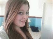
 This is Chloe Smith, she is 17 and currently studying her A-levels at Lutterworth College. She likes to be individual and has a very lovely personality. Small things amuse her and she's always someone to have a good laugh with or most of the time at. She likes a lot of different types of music, however because of her individual personality she likes to lean towards the Indie side of things. Her favourite bands include Arctic Monkeys and Vampire Weekend. She also loves Florence & the machine. As well as her music Chloe is very interested in fashion. Her favourite places to shop are American Apparel & Urban Outfitters, however she also likes to shop in small unique shops like wardrobe and wild when she gets the chance.

 Pictures: I chose these pictures out of all the ones i took because i thought that they were the best quality
 Lots of pictures: I chose to add plenty of pictures because i feel it adds realism. Photo shoots in a magazine look really proffesional and i feel that i wanted to add this look to my magazine. I think that my target audience would appeal to these pictures and that they would catch their eye better than alot of wording.
 I used the computer for the use of photoshop. This help me to present my magazine in a presentable way. I only used 2 things to help me create my product, and this was the main thing, as magazines are published on photoshop. I took my pictures with my phone, and then uploaded them to this computer. Then, on photoshop i was able to cut my model oout and add her to my page. I used gradient tools and all sorts of other technologies. In this process i have learnt how to use photoshop, as i didnt have clue before. I have also broaden my skills on cutting out shapes and using tools to make photos look different.


