

Thursday 28 January 2010


Magazine Article
My Magazine Article will be an interview with the band on the front. It will consist of questions about them and their music career. I asked a few people some questions on music magazines. One of the questions was " What they would rather read about in a music magazine". From the bunch of people i asked "An Interview" was the favourite and the one that they all picked, so that gave me inspiration to put that on my double page spread. The Interview will include information about their chart success, their up and coming tour of 2010, parties and all things that no other magazine can get their sneaky little hands on.
Friday 22 January 2010
Double Page Spread Analysis
This double page spread really inspires me. I love the layout of it and i also love the font. The way Lily is standing is quite simple but it looks really effective and gives off "attitude". Lily's clothes also co-ordinate with the colours on the magazine, which is a good idea, so that the magazine doesnt look too busy. The writing underneath the font is very small. However this is a good way of doing it, if you want the headline and the picture to stand out. I think this is by far the best double page spread i have looked at, because compared to the others, it looks really good and is quite simple to create.
 really inspires me. I love the layout of it and i also love the font. The way Lily is standing is quite simple but it looks really effective and gives off "attitude". Lily's clothes also co-ordinate with the colours on the magazine, which is a good idea, so that the magazine doesnt look too busy. The writing underneath the font is very small. However this is a good way of doing it, if you want the headline and the picture to stand out. I think this is by far the best double page spread i have looked at, because compared to the others, it looks really good and is quite simple to create.
Thursday 21 January 2010
Bands/Artists that I want to include in my mock-up magazine.
These are just a few bands that i intend to write about in my magazine:


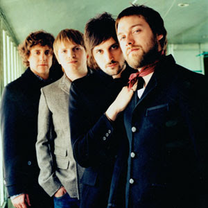
Kasabian are a British Indie Rock band who formed in Countesthorpe, Leicestershire in 1999. The band currently consists of Tom Meighan (Vocalist), Christopher Karloff (Guitarist & Keyboardist), Sergio Perzonna (Guitarist & Backing Vocalist) and Ash Hannis (Drummer).

Bombay Bicycle Club are an Indie Rock Band from Crouch End, London. They formed in 2005, and the band currently is composed of Jack Staedman (Lead Vocals, Guitar, Xylophone), Jamie McColl (Lead Guitar, Backing Vocals), Ed Nash (Bass Guitar, Keyboards, Vocals) and Suren de Sarem (Drums, Guitar and Backing Vocals).

Florence and the Machine is the recording name of Florence Welch and a collaboration of other artists who provide backing music for her voice. Musically Florence and the Machine's sound is generally referred to as soul-inspired indie rock.

The Arctic Monkeys are a English alternative rock band from Sheffield. Formed in 2002, the band currently consists of Alex Turner (Lead Vocals & Guitar), Jamie Cook (Guitar), Nick O'Malley (Bass Guitar & Backing Vocals) and Matt Helders ( Drums & Backing Vocals). The band has had former members in their early years.

The Temper Trap are a rock band from Melbourne, Australia. They are noted for their atmospheric sound, featuring grand guitars set to pulsating rhythms.

Kasabian are a British Indie Rock band who formed in Countesthorpe, Leicestershire in 1999. The band currently consists of Tom Meighan (Vocalist), Christopher Karloff (Guitarist & Keyboardist), Sergio Perzonna (Guitarist & Backing Vocalist) and Ash Hannis (Drummer).

Bombay Bicycle Club are an Indie Rock Band from Crouch End, London. They formed in 2005, and the band currently is composed of Jack Staedman (Lead Vocals, Guitar, Xylophone), Jamie McColl (Lead Guitar, Backing Vocals), Ed Nash (Bass Guitar, Keyboards, Vocals) and Suren de Sarem (Drums, Guitar and Backing Vocals).

Florence and the Machine is the recording name of Florence Welch and a collaboration of other artists who provide backing music for her voice. Musically Florence and the Machine's sound is generally referred to as soul-inspired indie rock.
Wednesday 20 January 2010
Case study Of Target Audience.
 This is Meg Whyte. She is 17 and lives In Lutterworth with her family. She is currently studying A-Level P.E, Biology, Graphics and Geography at Lutterworth College. She runs a busy lifestyle and takes part in alot of extreme sports including mountain biking and rock climbing. She has a passion for music and her favourite genre is Indie. Her favourite bands are Kasabian and the Rolling Stones. Her favourite things to do are mountain biking and rock climbing but she also enjoys taking part in surfing when on holiday, shopping, socialising with her friends, listening to music and going out to parties. When shopping she doesnt mind where she buys her clothes from, but her favourite stores are American Apparel, Urban Outfitters, and Topshop. She loves to keep up with with new trends but has her own individual style which she likes to maintain.
Thursday 14 January 2010
Audience Feedback on my Pitch.
Name of Group and task idea: Sophie-Magazine called Replay.
Genre: Indie
Target Audience: Teenagers- Boys & Girls.
Other texts it reminds you of: NME, Q.
Potential Problems:
Genre: Indie
Target Audience: Teenagers- Boys & Girls.
Other texts it reminds you of: NME, Q.
Potential Problems:
- Effort
- Needs to be more organised.
- No proper story thought out.
- Unsure story.
- Unsure of story which could affect planning and final magazine.
- Target audience.
- Cluttered front page. How are you going to put a different spin on your magazine to make it unique.
- Looks more feminine.
Positive Comments:
- Good pictures that are interesting. My age group.
- Good colour pallettte, which appeals to both boys & girls.
- Similar to my taste. Purple/Black/White-colours work well together.
- The idea and the name.
- Purple/Black and White. should look good.
- Good colour scheme which fits the genre.
- Good colour Pallette.
- The theme is articulate and has potential. Colour scheme works really well.
- Design on moodboard looks good.
- Colour scheme of Purple/Black/White will look good.
Advice/Suggestions:
- Sort out main story.
- Make the subject of the double page spread the main feature on your front page.
- Use small bands.
- Make sure you make it appealing to both boys & girls.
- Keep Going.
- Try to think of a story to base planning on.
- Decide Story.
- Research more magazines.
- Produce a mock-up of the magazine in order to really understand the context & research more magazines and choose an official style model.
- Organise yourself more e.g know your stories.
- Use popular bands.
Thursday 7 January 2010
25 Word Pitch.
My Magazine will be called Replay. The target audience will be unisex. My 3 colour pallete is purple, black and white. The genre will be Indie.
Double Page Spread Analysis.

This double page spread of Q magazine has a real interesting picture on it. I would say that the target audience for this magazine is men aged between 25-35, because the picture of Madonna would probably attract men more than it would women. I think that when creating a magazine you need a interesting action photo of someone rather than a boring photo of someone just standing there. Although sometimes it can look good but only when it's done properly. The colours are interesting but i dont like the orange because although they have made it big i think that some people would till find it hard to read. I love the way they have made Madonna's name stand out from everything else. The writing on this page is very small which again some people would find hard to read. So thats another thing that i dont like. The black background used is good for the bright colours to stand out a bit more than they would on any other colour. The picture of Madoona really inspires me and i would love to have something similar on my magazine.
Contents Page Analysis.

This contenets page has just the right amount of informtion and pictures. It sticks to the three colour palette of red, white and black very well. The picture is simple but effective and the cover lines over the picture really stand out due to the bold colour. Most things on this magazine are very simple to do, however they look really effective if you do it right. Such as the font of the masthead. It's quite a simple font but it's really striking and really drags your eye to it. I think black writing is always the best and easiest to read so if i were to buy this magazine i would find it easier to read than trying to read a magazine with writing of a brighter colour. The headlines are short and snappy, which i think is a good way to keep your reader interested, because if they were to long the reader would get bored and move on.
Sunday 3 January 2010
Practice Magazine Cover.

I created this magazine from pictures and fonts from other magazines. I thought id have a practice at making one, so that id have got use to the layouts before starting my real version. My real version is not going to be anything like this, however i think im going to call my magazine the same as this magazine is titled. I found these words on a page in "Style" magazine and they really stood out to me. When creating this the only magazines available to me were fashion magazines, which is why its based around fashion and not music. However my final version will be a music magazine.
Subscribe to:
Posts (Atom)

