

This was my intial way of swapping things round and experimentig with my magazine. I think the model in the centre doesnt look as good as if it was down the side, because the masthead then covers more of the models body. I prefer the cover lines on the right hand side of the model and i like the way they overlap the model's body.

I thought that instaed of moving the model and cover lines around on the page, i would move the barcode, and i really like the way it's displayed. I think with the barcode at the top, it make sthe magazine look unique. It also runs in with the genre, because as my magazine is an indie magazine it will have an individual style, so the barcode being in a unusual place really represents that.

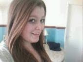
This version is a little bit all over the place and even though none of them are finished this one looks the most unfinsihed because its untidy. I dont like the placement of the coverlines or the barcode as it's very boring. However i do like the placement of the model down the side.

This version is a little bit all over the place and even though none of them are finished this one looks the most unfinsihed because its untidy. I dont like the placement of the coverlines or the barcode as it's very boring. However i do like the placement of the model down the side.
I think that now i have experimented with my layouts, i now need to do the same with my colour palette to make it stand out more. One idea that i am definately keeping is the background collage, as i think it's a unique and unusual way of making a magazine look a bit different. However, the collage will be made from all my own pictures and ideas, not from pictures that have already been took by someone else.


No comments:
Post a Comment